Monday, 29 April 2019

Volunteering


I do my voluntary work every Tuesday at Dalton Junior and Infant School, I chose to do my voluntary work here as  it was my old primary school therefore holds many great memories for me. After receiving my offer for the SCITT at Kirklees and Calderdale training centre they advised me to get some more experience and volunteer at a different school if possible. 

I had previously done my volunteering at Berry Brow Infant and Nursery School and I really enjoyed my time here. I worked in a reception class of 54 children and I think working in such a chaotic environment really improved my confidence in the classroom. 

Dalton school is very different, the class sizes are much smaller.
I am now in a year 2 class of 24 pupils. 

The routine: 

Morning: Arrive at school and get briefed on the day and help set up the classroom

8:40: Help them children with their morning activities.

9am-10am: Usually after registration the children have an english task, during this I take some of the children out individually and help them with their reading. I often ask the children questions about the books they are reading or ask them to recap things they have read.

10am: The children have a 15 minute playtime 

11am: After milk time there is then a short maths lesson which I assist with, I help by taking the children through the questions step by step and talking them through how to answer it. 

12.40pm: Lunchtime

1.40pm: After lunch we usually do RE or art I then use this time to take more children out for reading. 

2.30-3.30pm: catching up on work that should've been finished earlier or doing some maths or spelling. 

Week 1: 05th March 
Week 2:  12th March
Week 3: 19th March
Week 4: 26th March
Week 5: 2nd April
Week 6: 9th April
Week 7: 30th April
Week 8: 7th May
Week 9: 14th May 
Week 10: 21st May

Thursday, 4 April 2019

final design


Here is the final design I have gone for, i did some quick mock ups to see how they would look in context and on different colour backgrounds to get some sort of idea. I am really happy with how they have turned out.


feedback

Hi,

Firstly, thank you so much for entering the Summer Ball poster competition! As always, we were blown away by the talent of the students here at Leeds Arts University. 
We had a really hard time choosing the winning entry, and unfortunately on this occasion you were unsuccessful. 

We were so impressed with all your designs and we’d love to get back in touch about designing the after party poster! So keep an eye on those emails in the coming weeks.
Also, make sure you check up on the Creative Opportunities Board, where we post creative freelance work and competitions from all over Leeds and the surrounding areas.

Thank you again for your submission.
Have a lovely weekend!
Emma

final 3 designs


here are my final 3 designs, the brief stated that you could send more than one design so I decided to submit all three variations. They are all very similar and use similar colours. 

Idea 3


i then created this third idea which is a combination of the first two designs. I took the flower elements that I really liked and used them in a more spaced out way as I really like how this looks. I think having more space helps the text stand out and makes it easier to read. I think the colour use also works well as it has a fun element but the dark blue also reminds me of a summer night sky. 


idea 2


I then experimented by doing another design on a lighter background to see if this looked more summery. I did a much more simplistic design and just used blobs of colour to use as text boxes. 


I found this idea was a lot easier to work with as it gave more interesting placement for the text and made the summer ball text stand out more. 


I then added some dots in which I took from the freshers branding I had looked at as I thought this looked more artsy and free.

I then made the background darker like the other poster I created and I decided that I much prefer this as it makes the colours pop more. 


idea 1


for my first idea I decided to keep the patterns around the outside edge to make sure that the text in the middle was clearly readable. I also used a frame to highlight the text area. 


I started off by adding in the information required however I wanted the 'summer ball' title to be the most prominent and legible so people know what the poster is about from far away. I decided to put this in the largest font size and make everything smaller/ thinner. I put the uni name in just an outlines text as it isn't a very important piece of information to be able to read from afar. 


I tried different lay outs for the date and time as I thought the design may look a bit boring if all the text was in a column. 


I then decided that having it straight on was the best option as it flows nicer. 


I the played around with the size of the text. As well as this I added more outline text, this worked well for the 'live bands and food available' sentence as the most important words ('bands' and 'food') are highlighted so can be seen from afar and this sentence doesn't make the poster look too cluttered.

design development


My idea was to use a very busy pattered background to replicate fun and excitement that will be at the ball. I decided to take some patterns from the internet and use these as background to get an idea of how this would look before spending lots of time doing my own. 

Floralium

Floralium. Abstract patterns set. by lisa_kalev on @creativemarket

looking at how to use floral designs on products such as packaging and cards.

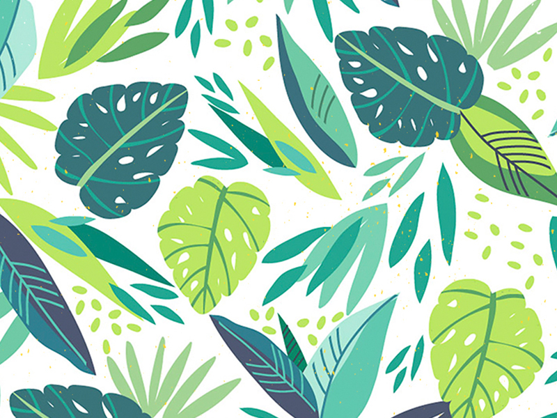
summer patterns

Related image

looking at bright summery patterns that I could potentially use as inspiration for a background on my poster.

Related image

Treat your gadgets to a free desktop wallpaper, designed by Susan Driscoll of The Print Tree.  Prepare to flower bomb your phone, tablet or computer with Susan’s paper, a bold floral print. Download seasonal papers for mobiles, tablets and desktops. Enjoy! x


colour choice

Image result for summery colours

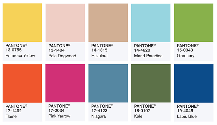
I took inspiration from these pantone colours - the summer colour trends 

Primrose Yellow

A greenish hue of yellow, Primrose Yellow exudes heat and vitality. Pantone was clearly inspired by warm, sunny days when they added this one to the 2017 spring/summer colour palette.

Pale Dogwood

What a marvelously quiet and peaceful take on old rose this is! If innocence were to have a colour, this one would definitely be it.

Hazelnut

‘Hazelnut’ is quite a peculiar name for this pale shade of brown if you ask us – perhaps ‘Chocolate Milk’ would be more suitable? – but it sure looks delicious. We know a timeless neutral when we see one!

Island Paradise

You can’t look at this gorgeous turquoise and not want to book a holiday on a tropical island. Cocktails, anyone?

Greenery: color of the year 2017

It’s zesty, it’s fresh, it’s Pantone’s color of the year 2017! Inspired by the first days of spring, Greenery calls us back to nature and reminds us to step back and take a deep breath once in a while.

Flame

This color is on fire! A fun orange with a red undertone, Flame is a flamboyant and vivacious hue with a hint of drama.

Pink Yarrow

Did it just get even hotter in here? That’s Pink Yarrow for you. Next to Flame, this festive, whimsical shade of pink really livens up the 2017 spring/summer palette, doesn’t it?

Niagara

Niagara reminds us that spring and summer have their rainy days, too. Not that we mind gazing out of the window looking at stormy, denim blue skies while sipping a summery drink…

Kale

Lush yet subdued, Kale is the kind of green that invites you to explore the great outdoors and pick some ‘primrose yellow’ flowers along the way.

Lapis Blue

Lapis Blue is the kind of electric blue that radiates pure energy. It’s strong and intense, yet oh so sophisticated.

initial ideas


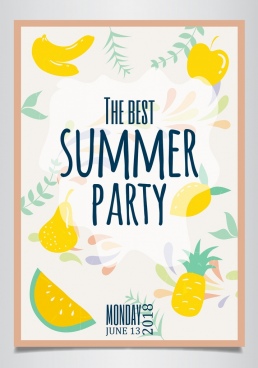
here are my initial designs for the poster, as the brief was a quick brief I went straight onto digital designs to save time. I started off with a basic white background and focused on the different type and colours I could use. I wanted a summery colour scheme so decided to go with pastels.

final designs


Final 48 sheet 


Final A3 Poster


Final full page magazine 


Monday, 1 April 2019

Summer pattern trends 2019

#1. Tie-Dye Accents

If you want to embrace the colorful and boho-chic side of the spring 2019, look no further than the tie-dye trend. We saw some designers use tie-dye motifs in an explicit nod to the ‘60s, while others found unique ways to use this fabric dyeing technique to achieve modern effects. Tie-dye was a big hit when it came to the prints we saw for the spring/ summer 2019 fashion trends, using both bright colors and pastels to play with an old fabric dyeing technique in all kinds of new and interesting ways.
Classic tie-dye T-shirts in blue came courtesy of Collina Strada and Paco Rabanne, while at Proenza Schouler and Tome, we saw tie-dyed denim dresses in the same calm color. R13 went full hippie with trippy rainbow tie-dyed jackets.
At Eckhaus Latta, tie-dyed jean trousers and jackets had a bit of a Rorschach effect. At Collina Strada, a softly tie-dyed bodysuit looked perfect for layering, although the choice to pair it with tie-dyed shorts was questionable to us.
Even at Dior we saw some tie-dye, which was used to tint the gorgeous silk fabric of some of the dresses. We also saw a touch of elegant tie-dye at Pradaand No.21.
Spring/ Summer 2019 Print Trends: Tie-Dye Patterns

#2. Animal Prints

Animal prints have been having their moment all of winter, showing up in both expected and unexpected places, and in totally new silhouettes. It is lovely to see the animal prints continues into the spring/ summer 2019 print trends, especially with cheetah, zebra, and snakeskin patterns.
Of note is the mix of subtle and wilder takes on animal print at Rihanna’s Savage x Fenty lingerie show that did not question the fact that animal print will forever be sexy.
Dolce & Gabbana is a brand that never shies away from animal prints, and this year was no different, with leopard reigning. At Burberry, we even saw some Dalmatian print!
Roberto Cavalli went all out, mixing different kinds of animal prints. Some of the other notable animal print offerings came from the runways of Simonetta Ravizza, GucciTod’s, and Tom Ford.
Spring/ Summer 2019 Print Trends: Animal Patterns - Leopard Prints
Spring/ Summer 2019 Print Trends: Animal Patterns - Snakeskin Prints
Spring/ Summer 2019 Print Trends: Animal Patterns - Zebra Prints

#3. Checks

One of the more austere spring 2019 print trends was checked patterns, especially on jackets and tops, but it also showed up on dresses. Checks featured in a mixed pattern outfit worn by one of the models in the Veronica Beard show.
The most exquisite example comes from Oscar de la Renta, with a lovely off-the-shoulder checked dress in black and white. Shimmering checks made from glued-on rhinestones decorated a see-through top in the Christian Cowan collection. Checks were one of the spring 2019 patterns mixed in with florals on the Dries Van Noten runway.
Spring/ Summer 2019 Print Trends: Checks

#4. Feeling Wordy

Words are a powerful tool that many designers chose to wield for the spring/ summer 2019 print trends, especially on their more casual designs. While in past fashion seasons slogans would get political, this year they were definitely more on the silly side of things.
The two standouts are the “when did they kill bambi” from Burberry, and Ashley William’s “Retired and loving it” – two cheeky statements that in context, are also nonsensical.
At Dolce & Gabbana, two models walked the runway, matching with one in a suit and the other in a dress both covered in a black and white comic book print, with the word “glamour” showing up repeatedly. Matty Bovan’s spring collection was all about neon punk sensibilities, with the words emblazoned in black over the colorful clothing being hard to read.
The typical logos were also on show, with clothes from brands like House of Holland and Pyer Moss loudly proclaimings their origins.
Spring/ Summer 2019 Print Trends: Word Prints

#5. Florals for Days

If florals hadn’t been part of the spring 2019 print trends I would have rioted. Once the spring season rolls around, outfits covered in florals are the perfect way of celebrating, and with so many different ways of utilizing these vivacious prints, anyone can enjoy.
Listing all of the designers to make use of floral prints would be an unending tasks, but I’ll point out some of the more noteworthy designs. At Simone Rocha, for example, busy floral prints were combined with retro silhouettes and veils for a serious and austere effect.
Soft florals made an appearance as part of Rodarte’s timelessly feminine collection, pairing well with an abundance of tulle and lace. Erdem gave us a more serious spin on florals, using a black pattern to decorate colorful dresses and suits that were also on the conservative side when it came to design.
At Anna Sui, florals were used to decorate all manner of dresses, day suits, skirts, and scarves, primarily made of silk, in loose fits inspired by the grand bazaar in the film Kismet.
Spring/ Summer 2019 Print Trends: Floral Patterns

#6. Polka Dots

Polka dots are a fun design element that pairs wonderfully with spring garments. We saw both cute, slightly retro takes on polka dots in the spring 2019 print trends and some more modern uses that had dots splashed over items in clever ways.
At Dolce & Gabbana, Andrew Gn, and Celine, we saw large polka dot prints dotted over feminine silhouettes. There was even a touch of polka dots in the otherwise patternless Marc Jacobs collection, proving their femininity. Polka dots were more haphazard and less symmetrical at Yohji Yamamoto, Marni, and Chloe.
We saw oversized polka dots over solid fabrics at Audra, on garments such as suits and loose dresses in wearable summer styles. At Escada, polka dots were used to give a whimsical touch to serious skirt suits, while on the Rejina Pyo and Carolina Herrera runways, they graced dresses without taking away any of their glamour.
Spring/ Summer 2019 Print Trends: Polka Dots

#7. Portraits and Photos

The spring 2019 prints and patterns were definitely iconic on many of the runways, but some of the ones that really stood out were the portraits, figures, and faces printed on some of the garments.
Old-timey cyclists graced the print of tops at Ports 1961. At Gucci, a pop-art style portrait was the main point of interest on sweatshirts, with a more modern take on photo prints also showing up at Toga. At Burberry, skirts were emblazoned with retro black and white prints, while at Simone Rocha, the prints were of painted portraits.
The most meaningful were the portraits of black children and families on tops, tunics, and dresses drawn by Derrick Adams for Pyer Moss. The collection was meant to imagine the African-American experience without the treat of racism, and as a result it was beautiful and touching.
Spring/ Summer 2019 Print Trends: Portrait & Photo Prints

#8. Silk Scarf Prints

There was a distinct bohemian and orientalist theme running through the spring 2019 print trends, with beautiful silk scarf prints being a large contributor.
My favorite example came from Marni, where boldly colored scarf-like fabrics were used to craft skirts and dresses. Models walked the runway of Erika Cavallini in autumn-colored dresses made of a scarf-like material, and decorated in a lovely silk scarf pattern.
At Loewe, Jonathan Anderson dressed models in dresses that were very explicitly scarf-inspired, with a dress made with a mix of scarf patterns ending with bits of fabrics looking like scarves that had come loose from the stitching, with a fringe and everything.
Spring/ Summer 2019 Print Trends: Scarf Prints

#9. Butterflies

Butterflies made it to the spring 2019 patterns all over the runways, acting as a perfect complement to all of the floral prints that we saw. They showed up both as prints and appliqués, and set our hearts aflutter.
The Luisa Beccaria runway seemed to flutter with thousands of butterflies that decorated lively pastel dresses, in addition to other seasonal prints including a ton of florals. A very unique take on butterfly patterns came from Mary Katrantzou’s collection, which featured plastic-y dresses covered in hyper-realistic butterfly prints, giving the feel of a preserved butterfly collection.
Spring/ Summer 2019 Print Trends: Butterfly Prints

#10. Paisley Prints

The paisley pattern is associated with all kinds of exotic, far-off locals. Since wanderlust was a motif running through many of this season’s collection, paisley was a shoo-in for the spring/ summer 2019 pattern trends. The original paisley design comes from Persian artwork, but the name refers to the Scottish town where paisley printed fabrics were produced once the pattern became popular in the West.
At Etro, a colorful paisley print was used to decorate a more sporty surfer swimsuit and jacket, although it also showed up on dresses and other more classic designs. Isabel Marant’s travel-inspired collection brought to mind far-off bazaars and bustling markets with dresses made of paisley patterned fabrics in a bohemian style.
We also saw paisley show up on ‘60s-inspired designs at Peter Pilotto and Chloe.

existing posters

Image result for university ball poster

I want to create a poster similar to this that is fun and exciting and screams summer.

Image result for university ball poster

Existing university ball posters are very formal looking and boring, I want to create something a bit different and less formal as the event isn't very formal like these are.


i also looked at the freshers branding leeds art union provided I think this is really unique and eye-catching, I think the squiggles and added extras to the lettering work really well and I would consider doing this on my own design. 


Leeds arts union

To get some idea of how to design the poster I looked at the design for last years ball. 


I find that the design is really bland and doesn't look very exciting. It doesn't encourage you to attend the event or attract attention to the event. The colour choice is not something that screams summer ball and the typeface is very dated. I want to create something that is the opposite of this.  
I also looked at the poster they had created for their lunch club which is a bit more appealing.  Again the colour pallet is very boring but the illustrations are quirky and represent the club well. 


Summer ball poster design

Design the 2019 Summer Ball poster!

After last years Summer Ball, Leeds Arts Union is throwing another! This is where we need you!  We'd love for you to create a poster/visual identity which we can use to promote the Ball.

The chosen design will receive 2 x tickets to the Ball and a £25 Trinity voucher.

We are asking you to design an A3 poster for the event.


The Summer Ball is a more formal affair than other Leeds Arts Union events, so the design needs to represent this.

The design must:
- Incorporate the Leeds Arts Union logo 
- Be clear enough for all students to read
- Leave space/placeholder type for the date and time
- Leave space/placeholder type for the venue
- Leave space/placeholder type for the ticket price
- Include the text 'Live Bands and Food Available'

This is intended to be a quick brief, and we'll get in touch if there's anything that needs tweaking. Feel free to submit more than one poster design.

Your colour design should be submitted as a 300 dpi PDF or JPEG by email to
student.union@leeds-art.ac.uk – Alternatively, feel free to WeTransfer all files to our email address.

All work should be submitted before MIDNIGHT, Tuesday March 26th 

Should you have any questions, please contact student.union@leeds-art.ac.ukor pop by the SU office.

Happy Designing!