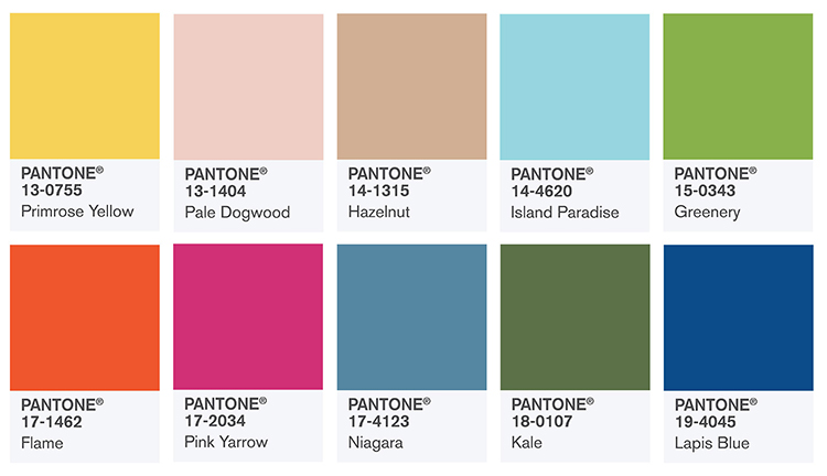
I took inspiration from these pantone colours - the summer colour trends
Primrose Yellow
A greenish hue of yellow, Primrose Yellow exudes heat and vitality. Pantone was clearly inspired by warm, sunny days when they added this one to the 2017 spring/summer colour palette.
Pale Dogwood
What a marvelously quiet and peaceful take on old rose this is! If innocence were to have a colour, this one would definitely be it.
Hazelnut
‘Hazelnut’ is quite a peculiar name for this pale shade of brown if you ask us – perhaps ‘Chocolate Milk’ would be more suitable? – but it sure looks delicious. We know a timeless neutral when we see one!
Island Paradise
You can’t look at this gorgeous turquoise and not want to book a holiday on a tropical island. Cocktails, anyone?
Greenery: color of the year 2017
It’s zesty, it’s fresh, it’s Pantone’s color of the year 2017! Inspired by the first days of spring, Greenery calls us back to nature and reminds us to step back and take a deep breath once in a while.
Flame
This color is on fire! A fun orange with a red undertone, Flame is a flamboyant and vivacious hue with a hint of drama.
Pink Yarrow
Did it just get even hotter in here? That’s Pink Yarrow for you. Next to Flame, this festive, whimsical shade of pink really livens up the 2017 spring/summer palette, doesn’t it?
Niagara
Niagara reminds us that spring and summer have their rainy days, too. Not that we mind gazing out of the window looking at stormy, denim blue skies while sipping a summery drink…
Kale
Lush yet subdued, Kale is the kind of green that invites you to explore the great outdoors and pick some ‘primrose yellow’ flowers along the way.
Lapis Blue
Lapis Blue is the kind of electric blue that radiates pure energy. It’s strong and intense, yet oh so sophisticated.
No comments:
Post a Comment