Sunday, 22 April 2018

Evaluation

In summary I am pleased with how my work has turned out for this project and I have really enjoyed it, in particularly studio brief 2 and found it really easy to get stuck into research and practical work. I was less enthusiastic about studio brief 1 on the other hand as it didn't really appeal to me as much but I gave it my best shot and think the work I produced was still appropriate and good for my genre. 

The thing I did take from studio brief 1 was how to design for something less serious that is of a throw away nature. It was nice to design something simple which I could imagine people reading out of curiosity at a football match and then bonding over whilst making their shakos. 

For studio brief 2 I got to explore a wide range of things and designed a calendar which I had never done before which is possibly one of my favourite pieces of work I have created so far and I am really proud of it. I have enjoyed being able to develop my illustrations more and incorporated these to support my work. I also enjoyed working on quite a serious topic which involves the environment and having to consider things such as recycled paper stock as I havent done a brief which requires this yet so it was interesting to learn about this side of things. 


In future I will allow more time for production and printing things, I managed to do this for studio brief 2 as I knew there would be a lot to print therefore 2 weeks to get this sorted. Studio brief 1 on the other hand was left until last minute as I thought it would be simple however I ended up printing the wrong document onto the only newsprint I had therefore couldn't print my final design on the paper I wanted to. 

final design


Here is my final design featuring the shako I made by following the instructions in the leaflet. Im really pleased with how it has turned out and think the leaflet suits its audience well. The crowds at college football games are relatively young, fun loving and up for a bit of fun therefore it is perfect for them. 


leaflet paper stock

To again keep costs down I decided to print my leaflet on newsprint as it is the cheapest paper stock available at uni. I really like the colour of it and think it makes the red in the design pop. The paper is slippery therefore created some smudges on the designs when printing however they didn't impact the design too much and I don't think it is worth discarding the idea to use newsprint because of this.


How to leaflet development


Here is my initial design for my 'how to guide' it is very basic but gets the job done, however I dont think it would encourage people to read it/ do what the leaflet is telling them therefore I need something more engaging. However I did create a hashtag and focus on social media therefore making it more of a social thing and more likely to be seen by people. 


I decided to add some illustration to my design as I think it is a simple and quick way to add a bit of excitement to the page. I think they would also help whoever was trying to make a shako as it gives them a general idea as to what equipment they need and when. 


Here is my final design, as you can see I have used the harvard crimson colour in my illustrations to make it look more official and consistent. I have also featured the lyrics to the thousand men of harvard which was something I found important and was hoping to fit in one of my designs some how. The logo on the front of the leaflet can be cut out and stuck on the shako made therefore enforcing their support for harvard football team and the band. 

Idea development

Taking inspiration from the pranks played by the crowd at Harvard football games I decided to create something different to a flag which was going to involve the crowd more. After watching the film Drumline and looking into marching band outfits I decided to make my project focus around their headwear. After doing some research I found out this was called a Shako and was originally a military hat. Harvard’s band don’t wear these however I think it is very stereotypical of what a band would wear therefore is fitting. 


After a lot of consideration I decided to make a guide on how to make a shako, the guide would be given out at one of the college football matches and give step by step instructions on how to make your own shako. The leaflet will then encourage the supporters to wear theirs to the next game. Not only is this funny and relates to the pranks/ silly things the members of the crowd do it also shows support directly to the band not just the football players.

Image result for marching band red

Band around box


To add more interest to the boxes I decided to add a sleeve around them, this was suggested previously in one of the crits and I was a bit worried about adding one as I thought it would get damaged in the post and be tatty on arrival. However after doing some research I found a lot of companies who do this therefore thought it must be ok. For a bit of reassurance I decided to create stickers for on top of the boxes as well just incase the sleeve goes missing/ gets damaged. 


I really like the end result and I am really glad I decided to make them as I think it looks more professional. 


Friday, 20 April 2018

Final box - small monthly


This is the smaller box which would be sent out to people monthly (the months after receiving the starter pack). As you can see it contains a lot less than the other box (there's also a card which has the seasonal fruit and veg for that month and a friend referral card to be added) However it contains the important aspects such as the seed packets and the growing guide which helps the user growing seeds from scratch as it can be a difficult process. 


Final box - starter pack


This is the final box and how I imagine it would look when the customer receives it. I really like the way the 'welcome' sticker looks and I think it make the box seem friendly and welcoming which would be encouraging in terms of persuading people to plant their own fruit and veg. 
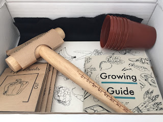
The box contains 6 plant pots, one for each pack of seeds which can be re-used every month to avoid waste. There's also a dibber which can be used to make sure the plant is planted far enough down in the soil and also helps to dig up seedlings and budding plants. As well as this there's also the seeds which are in the small monthly boxes too. Another thing that is in both boxes is the growing guide which gives advice on growing the specific fruit and veg each month. The thing that makes the starter pack stand out the most is the calendar which shows the seasonal fruit and veg for each month to influence people to buy more UK grown crops as well as grow their own. There's also 2 pieces of felt in the box which are required for the germination process of some of the seeds. 


Tuesday, 17 April 2018

Distribution

How people will find out about the subscription box:

- social media
- super markets
- leaflets
- friend referrals
- posters

I imagine people will order their subscription box from a website similar to graze and other subscription box services.

Sustainability with in my practice

As the issue I was looking about involved reducing a persons carbon footprint in terms of consuming less imported food. As well as this I want to reduce the amount of packaging they will waste each year by buying fruit & veg that doesn't necessarily need to be packaged. For example, cucumbers, they are sold wrapped in tight plastic but this isn't necessary and doesnt offer much protection therefore is a waste. By growing our own fruit and veg we are helping the environment in a small but impactful way. It would be hypocritical to have a problem with people wasting so much packaging from fruit and veg if I was to produce even more waste with my subscription box. Therefore throughout my project I have tried to use recycled materials and stock where possible as I think this is an important aspect of my brand, all the materials used can also be recycled therefore will not go to landfill.

This makes the production cost of the box more expensive and the average price of the larger box would be about £10 to produce, however I think it could retail for about £15-£20. The smaller box was much cheaper to produce and I think they would be sold for £5.99 a month.

Overall I think the product has to be a printed thing as it wouldn't work as well online as it is targeting working people who don't have much time on their hands therefore need something convenient.

booklet production


After printing the booklet it was time to bind it, I chose to go for a saddle stitch bind as I thought this would compliment the booklet, it is also quick and easy to do for mass production.


I then trimmed down the book to this square shape, I wanted to booklet to be small and easy to take places or store. Overall I am really pleased with how it has turned out and think it looks very professional as well as being sustainable and appropriate for the project.

Producing the box stickers


In the crit it was suggested that I should make the box more exciting by adding pattern or something to the exterior. I really liked this idea and thought that adding a bit of interest to a plain would work well. I decided to also add more excitement on the inside of the box as I think it would make people desperate to open them and see what was inside which is an important part of keeping customers interested. I bought some stickers online which can be printed on as I thought this would look nice in the lid of the box. 


Monday, 16 April 2018

Anziano Pro Regular


Image result for anziano typeface


About the foundry

Stefan Hattenbach (born 1961) is an espresso-fueled type designer with a background of many years as an art director in the advertising business and as a freelance graphic designer, specialising in logotypes, identities and book covers.
After three decades in the industry, he has managed to keep his work strong and compelling via a dynamic balance of experimentation and traditionalism. Since 2012, he has worked full time designing custom typefaces for major Swedish clients - around 50 to date.
He is an avid traveler with a special passion for Italy, and proudly claims A.S. Roma as his favorite soccer team.


box design mock ups


To get an idea of how the box would look in real life with these additional things, I printed some designs out and placed them on the box. I think the box benefits from having something on it as it makes it more obvious as to where it has come from when people are waiting for their subscription box each month. 


I then tried to experiment with colour and how this would look, however I decided against this as I think black has more fo an impact. 


calendar


After producing my calendar, I then placed it around my house to see what it looked like in context. I thought about where it would be hung in the home, most of the time calendars are hung in the kitchen. I found that because the calendar isn't too heavy and the string is pretty long, it can also be stuck the the fridge using a magnet. As well as this it can be hung on a wall like calendars usually are.


harvard stadium

Harvard Stadium aerial axonometric.JPG

Harvard Stadium is a U-shaped college football stadium in the northeast United States, located in the Allston neighborhood of Boston, Massachusetts. 
Built in 1903, it was a pioneering execution of reinforced concrete in the construction of large structures. Because of its early importance in these areas, and its influence on the design of later stadiums, it was designated a National Historic Landmark in 1987. 
The stadium is the nation's oldest permanent concrete structure dedicated to intercollegiate athletics.
The stadium is owned and operated by Harvard University and is home to the Harvard Crimson football program. 
The seating capacity of the stadium is 30,323; it seated up to 57,166 in the past, as permanent steel stands (completing a straight-sided oval) were installed in the northeast end zone of the stadium in 1929. 
They were torn down after the 1951 season, due to deterioration and reduced attendance. Afterwards, there were smaller temporary steel bleachers across the open end of the stadium until the building of the Murr Center (which is topped by the new scoreboard) in 1998.


Harvard Stadium hosted one Boston Patriots season in 1970. It was their first season in the NFL after the AFL–NFL mergerand their last before becoming the New England Patriots. 
The team moved to Schaefer Stadium in Foxborough the following season. The Patriots had previously played at Boston College (1969), Fenway Park (1963–68), and Boston University Field(1960–62).
 

Publication design

As the publication would be given out at Harvard football matches the thousands of people (the capacity of the stadium is 30,323) I need the publication to be as cheap as possible. I decided to have a booklet which is created from a large piece of paper folded down as I thought this would be cheaper in terms of production as it wouldn't need binding or multiple pages. 


I made a template on indesign which shows where to document will be folded down. I did initially design it to A3 however after doing an A4 mock up I think I could potentially down size which again will cut costs.

10 thousand men of harvard - fight song

Illegitimum non carborundum;
Domine salvum fac.
Illegitimum non Carborundum;
Domine salvum fac.
Gaudeamus igitur!
Veritas non sequitur?
Illegitimum non carborundum -- ipso facto!
Ten thousand men of Harvard want vict'ry today,
For they know that o'er old Eli
Fair Harvard holds sway.
So then we'll conquer old Eli's men,
And when the game ends, we'll sing again:
Ten thousand men of Harvard gained vict'ry today!
The Harvard University Band generally plays the song after every score by the Harvard football team, after every goal scored by the Harvard men's ice hockey team, as well as at the beginning and end of every period of a Harvard men's ice hockey game.
The "Latin" verse, written in 1953 and subsequently adopted by the Harvard Marching Band, is dog Latin (a pun), as "illegitimum non carborundum" loosely means, "don't let the bastards grind you down."
As typically performed by the Harvard University Band, the second and third verses are, respectively, another dog Latin verse with lewd lyrics (always covered up by loud drumming), and just the syllable "la" over and over again.

sb1 - final idea

After a lot of consideration and thoughts I have decided to make a cheap publication that would be handed out at Harvard games. In this publication there are instructions into how to make a Shako, a hat commonly worn by marching bands. I may also incorporate some of the lyrics to the songs sung by the marching band and a guide to some of their signature moves.

Harvard Font

When deciding on a typeface to use for the publication, I looked into what fonts were used by Harvard as I wanted it to look like a serious Harvard publication.

The following fonts are designated for use in Harvard signatures and signature extensions.  Anziano Pro is the designated serif font and Benton Sans is the designated sans-serif font.

SIGNATURE FONTS

Anziano Pro

Anziano Pro is a transitional style font that features a flat apex on its letters “A” and “V” among others, furthering its resemblance to the engraved, Roman-style it was based on. Anziano Pro bears some resemblance to the font Albertus but has a softer curve to its serifs. Anziano Pro features a short foot on its serifs–more so than other serif fonts in this classification. Anziano Pro is derived from a Roman engraved style of font and thus uses less contrast in its stroke weights. Each of the three weights available for Anziano Pro are represented below.

Anziano Pro should only be used in files with the Harvard wordmark. Anziano should not be used for headers or for body text.  Please use Caslon for body text and for headers in a serif font.

Benton Sans and Benton Sans Condensed

Benton Sans should be used as the supporting typeface of Anziano Pro when tertiary information is used. It should NOT be used as the primary font. Each of the weights available for Benton Sans and Benton Sans condensed are represented below.

In addition to its use in signatures, Benton Sans can be used as headers in web and print design.

BODY TEXT AND HEADER FONTS

Web fonts - Serif and San Serif

Georgia, a serif font, and Arial, a sans serif, are recommended for use on the web.

Print fonts - Serif and Sans Serif

Caslon is recommended for body text and for headers. Benton Sans is recommended for body text and headers.

Decorative Script

Shelly Script is recommended for a decorative font.

Thursday, 12 April 2018

wooden dipper packaging


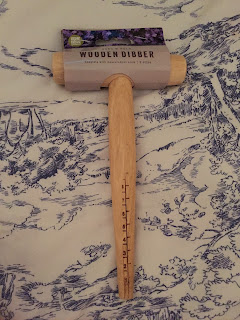
I purchased a dibber to go inside the large starter pack box as I thought it would be a useful tool for newbies to guarantee they are planting their seeds far enough down in the soil. As you can see it was already packaged but I wanted to make it more suitable and fitting with the plant out theme therefore I have decided to design my own packaging. 

Firstly I made a net on illustrator using the dimensions from the existing packaging.  


as the product is not going to be sold i dont need to worry about having holes for it to be presented on racks in shops, it also doesnt require a barcode. 

I created two very similar designs, the only difference being the size of the logo. I took inspiration from the previous packaging as I thought this was informative however it didnt really explain what the dibber should be used for therefore I decided to add a simple description on the back. 

Here is the design printed out on cheap printer paper to get an idea of the overall effect. i really like the simplistic look of it and think it will look great on a textured piece of paper/ card. However I do find that the logo is a bit too small.


Here is the design with the larger logo, I think it works really well and complements all of the other design work so far. 


Here is the design on the back of the packaging, as you can see it is very simple yet straight to the point. I think this will be appreciated more by the consumer as they are likely to be new to grading therefore won't want to be confused by anything. 


Box content

Starter pack (large box)

- plant pots
- wooden dibber
- calendar 
- growing guide
- seeds
- friend referral card
- monthly activity card

Monthly pack (smaller)
- growing guide
- seeds
- friend referral card
- monthly activity card

calendar production

I came across a recycled card being sold by a shop on eBay, I chose to go with 'Via Felt, Flax, 220' as I liked the texture and subtle pattern it has. As the calendar will be displayed in people's homes I wanted it to be of good quality and blend in with most peoples decors therefore I decided on keeping the design and colours very neutral.


The description of this is:
VIA FELT - Via Felt is recycled card/paper with the structure of felt and delicate natural inclusions. Available in 220gsm.


Here is the final look of the calendar after printing it out. I have looked at ways I could potentially display it and thought about having a piece of wood which would hold all the sheets upright. However I think this product would be better displayed on a  wall as this would make it more visible and less likely to get knocked over or ruined. I have deiced to create a hook by punching a hole through all the sheets and tying them all together with a piece of string. I think the string idea relates nicely to gardening as it is often used to tie plants together and support them in their growth process. 


calendar design

As I already had the poster design nailed it was easy for me to scale this down and make it into a calendar.


I simply added the days and dates to the bottom of the poster design which I think works really well. I wanted to keep the design simple so that the majority of the focus was on the fruit and veg illustrations as these are the most important aspects of the calendar.

I then applied the same process to each month a created very cohesive looking calendar. Some months have less fruit and veg in season than others however I have managed to make the designs still look interesting and impactful.


Here you can see small images of the designs and how they look all together. It is clear to see where the summer months are as they are the months with more fruit and veg in season.

To produce my calendar I need a suitable paper stock, as my project is based around sustainability and the environment I decided I need a recycled paper stock.

Tuesday, 10 April 2018

paper stock

As the subscription box is focused on sustainability and making a small change to help the environment I wanted to use a paper that is also environmentally friendly. I went into a few stationary / craft shops around huddersfield in hope to find some good quality recycled paper however I struggled with this task. I want paper with a texture that feels more organic and looks interesting. A lot of the shops I visited didn't have much information about the paper they stocked therefore I decided to order it online. This was a bit of a risky move as I was unable to feel the paper before buying it but I knew I would be guaranteed to get something recycled and good quality. 

Here's a list of paper I looked at:

100% Recycled Eco Kraft Paper - Brown - 130 GSM Pack size 100 sheets size - A4 This Eco Kraft paper is a natural product with a soft feel. This lightweight paper is ideal for all art and crafting uses. Card Making, Birthday & Wedding Invitations, Restaurant Menus, any special occasions etc. This craft paper is suitable for copiers, laser and inkjet printers.

Eco Craft

Natural Kraft recycled 130gsm A4 paper

100% post consumer waste

Fibrous organic texture

Suitable for Letterpress, full colour, foiling, embossing & screen printing, most laser & ink jet printers although if in doubt please have a test run, samples are available above,

*please note due to the nature of the card there can be variation to shade between reams*

Available in 100gsm, 150gsm, & 300gsm also

Brown Kraft - All gsm's  available in A5 & A4

280gsm available in A6, A5 A4


HP Recycled paper
  • 100 % Recycled Paper
  • Engineered for high-volume copiers, yet versatile enough for everyday use in printers
  • Resists jams in high speed laser printers and copiers 
  • Suitable for a wide range of everyday outputs 
  • Ideal for everyday business documents and B&W outputs


Sunday, 8 April 2018

Seed paper

What you need:

  • Used printer paper, cross-cut into tiny pieces by a paper shredder. Use 1-1/2 cups for each card.
  • Large bowl of warm water
  • Window screen material
  • Small embroidery hoop
  • Food coloring (optional)
  • Blender
  • 9 x 13-inch baking pan
  • Packet of wildflower or other seeds
  • Bath towels or several layers of felt squares
  • Waxed paper
  • Colored markers

What to do:

  1. Soak the paper pieces in the bowl of water overnight.
  2. Put the soaked paper into the blender, then fill the blender halfway with fresh water.
  3. Blend until the mixture is soupy.
  4. Add food coloring, if desired, and blend some more.
  5. Fill the baking pan one-quarter full of water, then pour in the blended paper mixture—or pulp.
  6. Slip the embroidery hoop with screen in from the side so that it slides beneath the pulp and seeds. If necessary, spoon some of the pulp over the screen.
  7. Lift the screen gently, catching the pulp mixture evenly on top and letting the water drain off.
  8. Lay the screen on a bath towel or felt layers to drain.
  9. Sprinkle some seeds on top of the wet pulp, and gently pat them into the surface of the pulp.
  10. When the bath towel or felt has soaked up as much water as it can, pick up the hoop and turn it over onto a sheet of waxed paper to dry. (Seeds will be on the bottom.)
    You may have to gently hit the hoop on the table or counter surface to loosen the pulp from the screen. If the pulp does not stick together, try putting more pulp on the screen next time. 
  11. Let the paper dry for at least 24 hours.
  12. If the paper does not lie flat, place a heavy object (like a book) on it for a few hours to flatten it.
  13. Decorate it with markers on the un-seeded side.

To plant the paper:

When you plant the paper, lay it on the surface of the soil and sprinkle about one-quarter-inch thick layer of soil on top. Water the soil lightly and keep the seeds wet until they sprout and have a few days to grow roots.

Friday, 6 April 2018

box design


After looking at existing design I thought about sourced box and how they use a piece of card wrapped around their boxes too add more colour and interest to the package. I did a quick mock up of how my box would look if I was to use a similar design to sourced. I think using this pattern from the month of June (the month I have decided to base my box on) which shows the seasonal fruit and veg of this time works really well. I want to use this pattern/ similar illustrations throughout the products in the box to enforce the brand and make it more recognisable.


I then added the logo to this design, I think the logo would be printed/ stuck on the box rather than on the card as I would be worried about this getting lost/ ripped therefore there would be no branding left on the box.


This is an example of the box without the sleeve, just a logo. I decided to reposition the logo in the middle as I think this makes it more impactful and more of a focus.


I then added the sleeve to this design to see if it would work with a centralised logo and I think it works really well. I like the contrast of the contemporary logo and illustrative design.


I then decided to remove the illustrations and just add the month name as I think this makes it more obvious as to what month the box is from if the consumer was to keep their boxes.


I then thought about giving each month a certain colour, as June is the start of summer I chose to go with this turquoise colour as I think it is very transitional between seasons and isn't too summery as something like orange/ yellow would be.


I then changed the text to white as I thought this would look better and compliment the sleeve colour more and I think it works really well.


I then changed the logo to be the same colour as the sleeve to make it more consistent and I think this looks a lot better than the previous designs. It is a subtle change that would be easy to do every  month but something that makes the customer excited to receive their box each month.


I then tried adding some of the fruit and veg illustrations for that month which I think looks nice but compared to the design prior it looks less impactful. I have decided to put these illustrations on the back of the sleeve instead.