Tuesday, 2 May 2017

Way finding lines/ arrows


here is our final simplified idea of what the exhibition floor plan would look like, we have removed the map from the door way and added lines instead, these then split off and direct people to different areas of the gallery. I believe this makes the space more approachable and friendly for people as  galleries are usually intimidating spaces. It also helps in terms of displaying the work as it wont just be random it will be categorised into postcode areas. The lines will be created by tape or vinyl stickers on the floor, they will match the style of the way finding used outside of the library therefore tying everything together and making it recognisable to people.


The arrows used outside to direct people to the exhibition will again be stuck on the floor, in a society where people spend most of their time looking down at their phone this is an eye catching way finding method. The stickers will come in directions from heavily populated areas of Leeds such as trinity and the train station, this will attract people who would not usually enter but may find it interesting.


To get the attention of other people who might not be looking down, the same idea could be blown up and printed on a wall around leeds to direct people and create interest. As the arrows contain the name of the exhibition it acts as an advertisement technique and creates publicity for the event as well as directing people to it. If people saw this but didnt have time to follow the arrow they could google it and find out what it was.
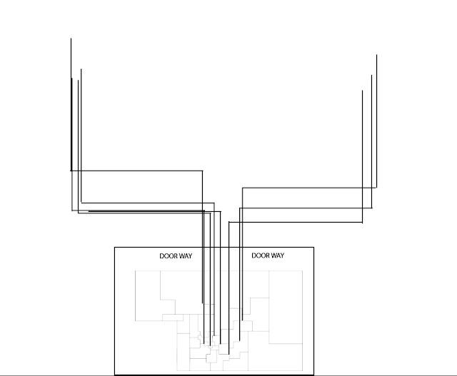
WAY FINDING FROM MAP


This idea is to have the map of Leeds in the door way of the exhibition room, from this there are lines coming off of it to direct people to specific pieces of work from certain areas on the map. The lines would be made from either tape or vinyl stickers. However this idea had to be scrapped as the exhibition room is too small and there would be too many lines (29 lines representing 29 postcode areas) 

We decided to change our idea and get rid of the map in the door way. Instead we will have the postcodes either painted on, or cut out of the tape to free up some space. Another space saving idea is to have a line coming from the door which is then broken off into two/ three lines of different postcode areas. 

Wayfinding, postcode plotting

Finding out the postcodes of the event locations  so that we can plot them all on a map.


We had the idea of putting a square on the map of leeds to symbolise that someone had done a poster based on an event there. The more events there the more populated by squares they are. This would be used for way finding in the actual exhibition, each area of the exhibition would be sectioned out into the same shape as the areas on the maps and they would all have their own postcode.

Tuesday, 25 April 2017

MESH Colour Scheme


Our colour scheme is inspired by the buildings around Leeds as a lot of them are red brick or concrete therefore we have swatched the colours from these and are using them as our colour scheme. The grey, black and white will be used for text and the red will mainly be used for way finding as it is eye catching and will stand out against the concrete pavement rather than using grey.


Most of the colours will come from pixilated versions of peoples posters being exhibited, we believe pixilating the image as above leaves a bit of mystery to what will be displayed in the exhibition. We will use this imagery for things such as social media count downs, the catalogue, the posters/ leaflets and the online invitations. 

Here is an example of the map of Leeds that is displayed on the catalogue, as you can see the pixilated image is being used for the colours of it. 


There will be a few variations of the catalogue, posters, leaflets etc using multiple different posters to add more variation and interest. 

Monday, 24 April 2017

Studio Brief 3 Crit

The swatches of the colours we are using for our branding, the swatches have been taken from the broadcasting tower in Leeds and concrete. This is to give a reference to the red brick that is commonly used in Leeds and the concrete to relate to the industrial side of Leeds. 


Here is our logo, it is taken from the first letter of our name 'mesh' we have used a grid system from the mesh to develop a pixilated aesthetic which relates to the method of printing and gives things a more hand made feel.


Ideas from the crit:

Using the grid to layout the posters in the exhibition, creating our own map of Leeds based on the areas that people are focusing on. The most popular areas will be represented as bigger squares and less popular as smaller squares.
From this we could have coordinates directing people around the gallery. 
In terms of way finding, consider using a pixilated curser arrow as it relates to the aesthetic we are going for. 


For social media look into making GIFs and animations counting down the days to go. Look into colour blind tests and doing them in this style. Also look at having moving squares/ pixels that move and become the logo and then move and become a number counting down how many days until the exhibition/ how many days left until it ends. 
To make it interactive have people send in pictures they have taken around Leeds using the #LEEDSMESH and make these into gifs by pixilating the image or dissecting the image into squares. 
In terms of brochure, have a big piece of paper that is folded down in a grid layout and features peoples work in each individual square created by folding. 
For the brochure, consider what paper will be used to print on, would newsprint look nice? It would be a cheap production method. 
Using instagram for a daily countdown to the event, uploading 12 images which when you look at them all together they look like a number. 


Tuesday, 4 April 2017

POSTER CRIT 2

My design hadn't changed since the last crit however I did have some questions to ask, these were:
Should I add text and what?
Are the two stripes (II roman numerals) of the old photo enough?

The feed back I got was:
To try using a V instead of the two stripes to reference the fact it was the victory parade. Even if not the whole letter V, try slanting off the ends of the stripes so the look more V shaped.
As for text, if you want to add some maybe look at newspaper articles about the victory parade and add a small strip of text from that at the bottom? Or find the original article that the image was taken from and use that? However no one found text to be essential

Overall I was happy with the feedback I received especially that no one saw any major issues and everyone thought it was a resolved piece. In terms of colour, I am going to continue to experiment with these during the screen print process.


When experimenting with text it became obvious to me that the design didnt need it. I think the text takes away from the image therefore I will not be using it.


Daniel Gee - Goat collective


"Holla, we are A collective of visual artists. Socially aware with a view to instigate change. Youthful and passionate. Professional and driven. We work closely together to provide diverse creative solutions. "

Collage artists that inspire Daniel:

Hort, simplistic collage. Very geometric.
Robert Rauschenberg, lesser known for his collage but it's very interesting to look at.
DR ME blown up in the past 3 years, 365 day of collage brought collage out of the ashes
Ill studio, very open to anything. Don't just specialise in collage. 
Louis Reith, pushing the boundaries of collage. Very minimalistic and geometric. Sticks to only using back and white
Ellery James Roberts, makes his own collages for his own album art work
Mat Maitland, uses lots of colour in his collage. Trades as a fashion photographer
Richard Prince, doesn't really use his own imager. Gets in trouble a lot for stealing other peoples images.
Ventral is Golden, very well known in Leeds and did the branding for Belgrave music hall
John Stezaker, very iconic in the world of collage and many people try to copy him. 


Exhibition 'art from non art'
Collage is the main theme of the exhibition
Submission deadline is the 3rd April


‘Art From Non-Art’ is a collaborative exhibition celebrating appropriation within the arts, specifically the medium of collage. The title of the exhibition refers to the act of appropriating pre-existing objects and images with little or no artistic value and transforming them into an individual piece of art. Applicants are encouraged to use both traditional cut and paste methods and/or digital manipulation along with any other medium they see fit.
There is no set subject matter for the designs, the only criteria is that all designs must incorporate appropriation  in some form. 

Deadline for Submissions: Monday 3rd april

All pieces should be submitted as a4 portrait format digital files (JPEG or PNG)
The designs will all be screen printed and displayed. Each artist will receive a limited edition screen print of their own submission.
A selection of the designs will also be included in a publication investigating appropriation in art & design in the modern day and throughout history.