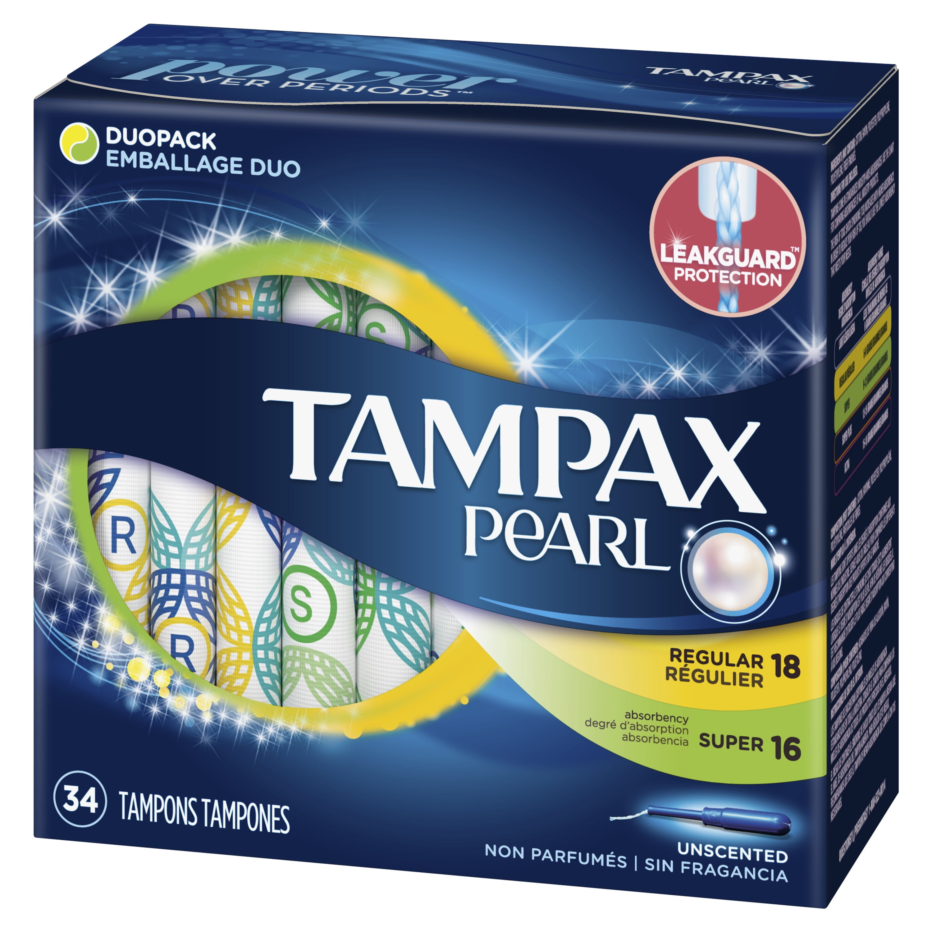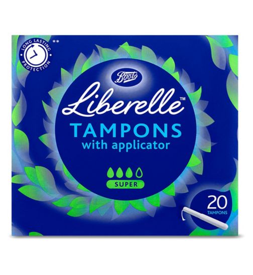


When looking at rivals you can see that bright colours are very prominent. Blue is the most popular colour. Some of them try make their packaging look fun and exciting which doesn't really work. All the packaging uses swirly drawings and patterns which could relate to 'flow' or 'cycle' which is clever however it is a bit over done. All packaging shows an image of the tampon applicator as most people prefer applicator tampons despite them being bad for the environment.
Featured on the packaging:
Brand name
absorbency
number of tampons
imagery usually of tampon
No comments:
Post a Comment