The Book
Wonder by RJ Palacio is a children’s book which has a moving message to match its powerful story.
Wonder by RJ Palacio is a children’s book which has a moving message to match its powerful story.
The book’s main character, 10 year old boy Auggie Pullman, has a facial deformity. After being homeschooled for most of his life, Auggie joins a 5th grade class in school. Wonder tells the story from the perspective of both Auggie and his classmates.
Wonder‘s message of tolerance, compassion, and kindness touched over 6 million readers and was adapted into a critically acclaimed motion picture starring Julia Roberts.
The Artist
Wonder‘s cover was designed by Tad Carpenter, although interestingly RJ Palacio was herself a book cover designer for over two decades before focusing on writing. As a result of her experience as both designer and writer, Palacio was able to provide instructions for the cover which gave the right amount of guidance while still allowing Carpenter to express his own artistry.
Wonder‘s cover was designed by Tad Carpenter, although interestingly RJ Palacio was herself a book cover designer for over two decades before focusing on writing. As a result of her experience as both designer and writer, Palacio was able to provide instructions for the cover which gave the right amount of guidance while still allowing Carpenter to express his own artistry.
The Cover
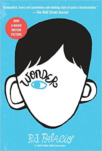
Wonder‘s cover makes use of a simple three color scheme, using blue, white, and black. The result is simple and easy on the eye.
Wonder‘s cover makes use of a simple three color scheme, using blue, white, and black. The result is simple and easy on the eye.
The main image is an illustration of a slightly out of proportion head, with a single eye. The book title text appears in the shape of an eyebrow.
Both the author name and the book’s tagline appear in a handwritten font at the top and bottom of the cover respectively.
Overall, the cover is appropriate for the children’s book genre. The illustration directly relates to the theme of facial deformity, the use of the single eye relates to the book’s narration from multiple perspectives, and the handwritten style of the cover text is appropriate for the intimate, personal nature of the book.
Your Inspiration
There are many points of inspiration to take from Wonder‘s cover. No matter whether you’re writing a children’s book or not, some of the ways you can apply ideas from Wonder to your own book cover include:
There are many points of inspiration to take from Wonder‘s cover. No matter whether you’re writing a children’s book or not, some of the ways you can apply ideas from Wonder to your own book cover include:
- A carefully chosen three color scheme. Many books feature a vast array of covers, or realistic photography. However, Wonder is an example of how striking and eye catching the classic ‘rule of three’ can be.
- Can you incorporate your book title into your main cover image? Wonder is able to make its title a cohesive part of its main image. You should only do this if it’s a natural fit, as it is here.
- Matching your book cover text to the feel of your book. The handwritten style works well here because of the personal and intimate nature of the story. You should ensure the text on your cover is just as fitting for the written content of your book.
No comments:
Post a Comment