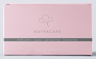
I started off by making the logo more simple and added a small cotton illustration. I chose to use the colour pink as it's feminine and calming. I then added a grey stripe across the box so highlight its key features.

I decided to change the background colour to blue as it made the white text more visible.
I decided to remove the grey line as it looked too harsh on the soft blue background.
I then played around with the layout and positioning of the things on the box.
When I was happy with the layout I altered the text that says '100% organic... etc' to a script text as I thought it looked a bit more delicate. I then played around with some patterns in the background as I thought it made them stand out a bit more. I liked the idea of having a different pattern for the different tampon absorbencies instead of using different colours.
To draw attention to the number of tampons in the box to make it easy to spot on the shelf I circled it in pink.


No comments:
Post a Comment