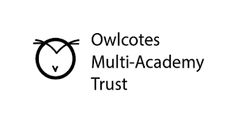
The design people preferred in the crit was this one, however there were some comments that it may be too stylised to be used for a primary school. It was suggested that I add some eyes to make it more obvious to children that it is an owl.
 I took the same eyes from another one of my designs as people thought it was a good idea to combine multiple of my designs. However I think this makes the owl look a bit crazy, if not scary! So I decided to alter them.
  I decided to get rid of the ring around the eyes to make them look smaller and less bulgy. I think this makes the owl look less crazy however there is still a scary element.
  I decided to draw my own eyes as I thought this would make them less harsh. I wanted them to be more of a curving shape to make them more realistic. However I don't like the look of this, I think they look a bit creepy.
I decided to make the eyes simplistic to match the rest of the design and I really like this design.
Overall I am really pleased with the work I have been able to produce in just 2 days I think it is suitable for the client but is still a bit different to the usual primary school logos you see.
Here is a mock up of how I imagine the logo would be used, they suggested it would be used on letter heads and printed material as well as online. I think this helped me get an idea of whether or not the logo would be suitable. I think the logo is very professional looking as well as being playful which I think is perfect for a primary school. The typeface ‘univers’ was chosen as it is a common typeface used in exam papers in the UK as if it very clear and easy to read therefore I thought this was a goo typeface to use because of this.


No comments:
Post a Comment