I came across this one for Econature hotel, without even reading the company that it's for you instantly know it is something to do with nature. I think the colour use adds to this as well as the plant like illustration. I want to produce something similar within my own work, however I think I will stay away from using colour. I have chosen to do this because the logo is sometimes engraved into gifts created by Made From The Woods therefore the most important factor is making sure it looks good as an engraving, not the colour.

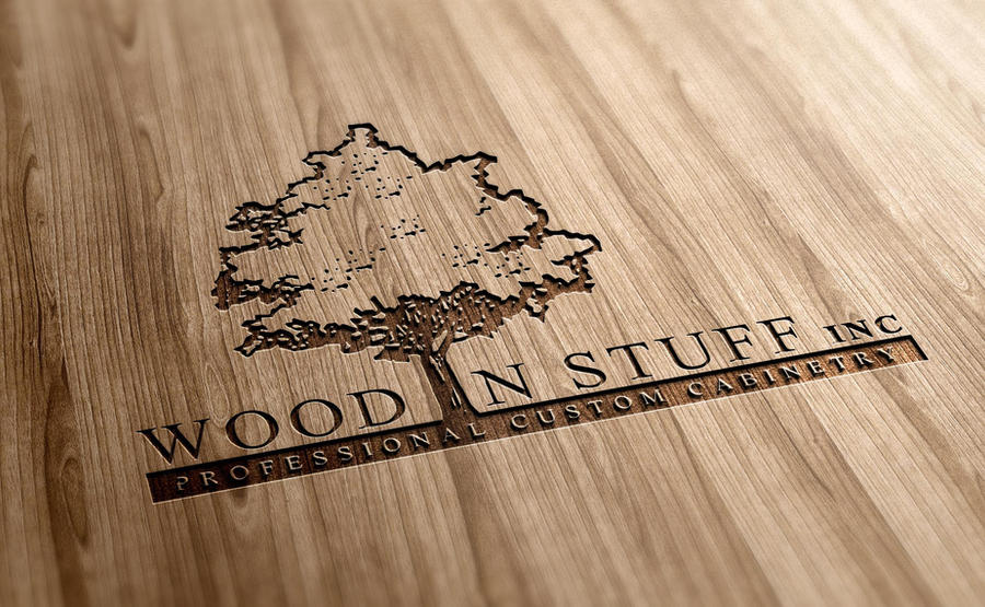
I then went on to look at engraved logos in specifically as I thought this would be more beneficial to me. I came across this one for a company who make custom cabinets. I think it looks very sophisticated and evidently sells expensive items. I really like their use of a serif typeface as I think it adds more age and stature to the brand, this is something I will consider on my own designs. As well as looking more up-market, I think the thin lines of the typeface carve really nicely into the wood and compliment the wood because of this.
No comments:
Post a Comment