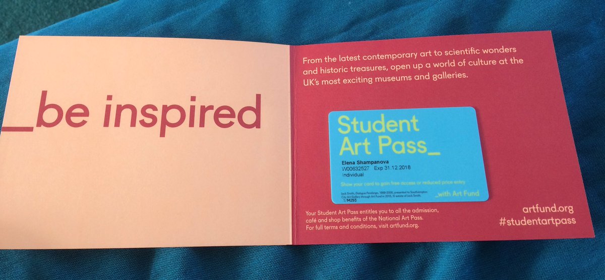
The existing art pass branding plays on the continuing line element of the logo which I like. It is very simple and uses very bright 90's colours which is nice as most people at uni were born in the 90's and potentially 2000 therefore playing on this makes it a bit nostalgic and will attract that age group.

The design on the actual pass is very simple but the colours are bright therefore it is easy to find in your wallet/ purse. The presentation card the pass is sent out in is also very simple and bright in colour, in my work I will look at making this more interesting and something the customer would potentially want to keep as I think this really helps with branding and reminding them to visit some of the places.
No comments:
Post a Comment