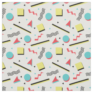
After looking into Rugrats imagery for inspiration as well as 90s patterns I wanted to take some of these elements and create a poster to use for the art pass campaign.

I wanted to design a shape to feature in the centre of my design to feature the art pass name in front of. I started off replicating the rugrat shape and then went onto simplify it, I decided to simplify it down to a triangle as I found this most suitable and 90's inspired.

I decided to use a lilac background for the triangle shape to sit on, I think these two colours really compliment each other and work well as a backdrop for my design.

I then added in some text in a typeface I liked from doing my research. I do like this typeface, however I think it is hard to read and wouldnt work well from a distance therefore I may try use a more blocky, easy to read font.

I decided to use arial black instead which I found was a lot more suitable and a lot easier to read from a distance.

No comments:
Post a Comment