I want the poster to include the seasonal fruit and veg, the month name, and the logo.

Here is my initial design, as you can see it is very basic but I wanted to see how I could use the space. As you can see there are a lot of fruits and vegetables in season in June therefore I need a more interesting and creative way to present them rather than just a list.

 I then added a few illustrations to give it a more personal touch as well as making some of the fruit and veg more memorable by seeing an image. I also personalise the titles 'fruit' and 'veg' with my hand writing mixed in.
I then added another illustration as I found the poster very boring and basic.

I was really stuck at this point as to how to take my poster further, the poster will be displayed in peoples homes like art work therefore I want something that looks this way. I want to reduce the amount of writing on it.
I looked into fruit and veg prints already on the market that people would display in their kitchens.


I found that the majority of them were illustration based and had a bit of a vintage feel to them which is something I will remember and try portray in my design. I really like the colours used and how vibrant they look however I know that this won't go with everyones home decor therefore I think limited colour use is the best option.

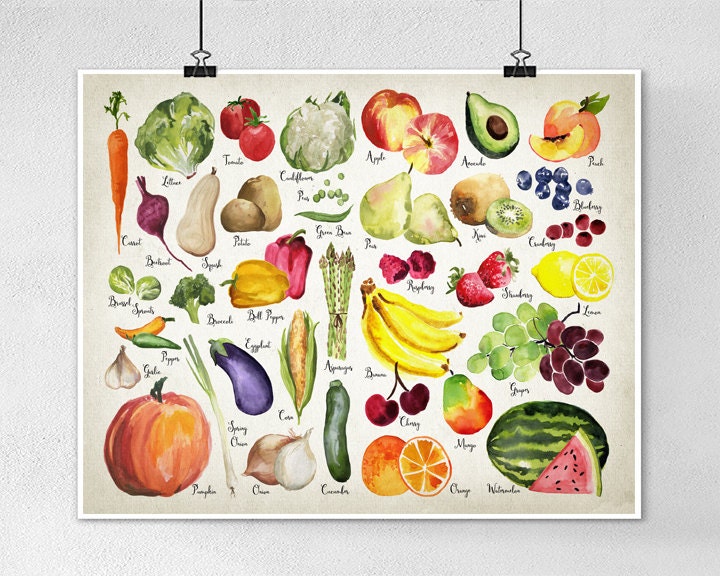
I then did illustrations of every fruit and veg in season for june which took a very long time ! However I think it was worth it as the result is better than I expected. I really like the design I have created and believe it is something people would be happy to display in their homes.

I then realised that I would need to provide a list of the fruit and veg as not everyone is going to be able to tell what they are from the illustrations so I added them to it but I couldn't find a way to do this and still have the poster look like a piece fo art work. I decided to put the list in the booklet I am creating instead as to not distract from my design.
As I am considering risoprinting my design I wanted to see what it would look like in the different colours provided by the printer.

Fred Aldous seems to be the best place for riso- printing as it is the most affordable and has a good range of colours and paper stock to choose from.


I sampled my poster in the two shades of green/blue they had on offer as I thought these would look more gardening related. I really like the look of both of them and think they would look really nice displayed on someones kitchen wall. I am still unsure as to what colour I will go for and think when I have developed the other elements that will be printed and sent out in the box I will then make a decision.
No comments:
Post a Comment