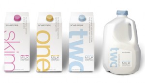
Designed by Capsule in the US. They designed the new look to communicate three things: clean and white packaging that communicates European sophistication, the use of the words 'one', 'two', 'whole' and 'skim' to reflect the milk's flat level. The last thing is to use rotating phrases that speak to the consumer in a none marketing language. Schroeder saw a 15% increase in distribution due to their new packaging and 22% increase in sales of milk.
This top image of the packaging reminds me of a protein brand that sells sports supplements etc, not a milk brand. The thing I like about the branding is their different weights in type to represent how much fat is in the milk, I think this is very subtle but a strong idea.

No comments:
Post a Comment